First Post
With the end semester exams coming up, I figured it’s the perfect time to start my blog (yeah, great timing, right?). As I was studying Graphs for exam prep, I wanted to implement something cool using them. After searching for a while, I stumbled upon this dataset. It’s from Moviegalaxies, a site that provides network graph data from around 773 films. Pretty neat, huh?
Data Processing
So, I took the raw data and processed it into a CSV file, showing how two characters appear together in a scene, which is represented as edges of a graph. For example, if you look at the Godfather, there are two scenes where Anthony and Michael both appear together. Here’s how it looks in the CSV format:
Source, Target, Weight
ANTHONY, MICHAEL, 2
Plotting the graph
Now that we have the weighted edges in our CSV file, we can plot them like any other weighted graph. I’ve used gephi for visualizing graphs before, but this time I wanted to stick with Python, so I went with networkx. It’s super well-documented and easy to use, as long as your data is in the right format. If you want the code I wrote, you can check it out here.
Community Detection
Community detection is basically about finding groups of nodes that are closely connected in the graph. These groups are called communities. In real life, brands can use this to understand different opinions about their products, or to find influencers. For our graphs, communities show groups of characters who appear together the most on screen.
I used the community module, which applies the Louvain method for community detection.
Pulp Fiction
Here’s how the graph looks for Pulp Fiction:
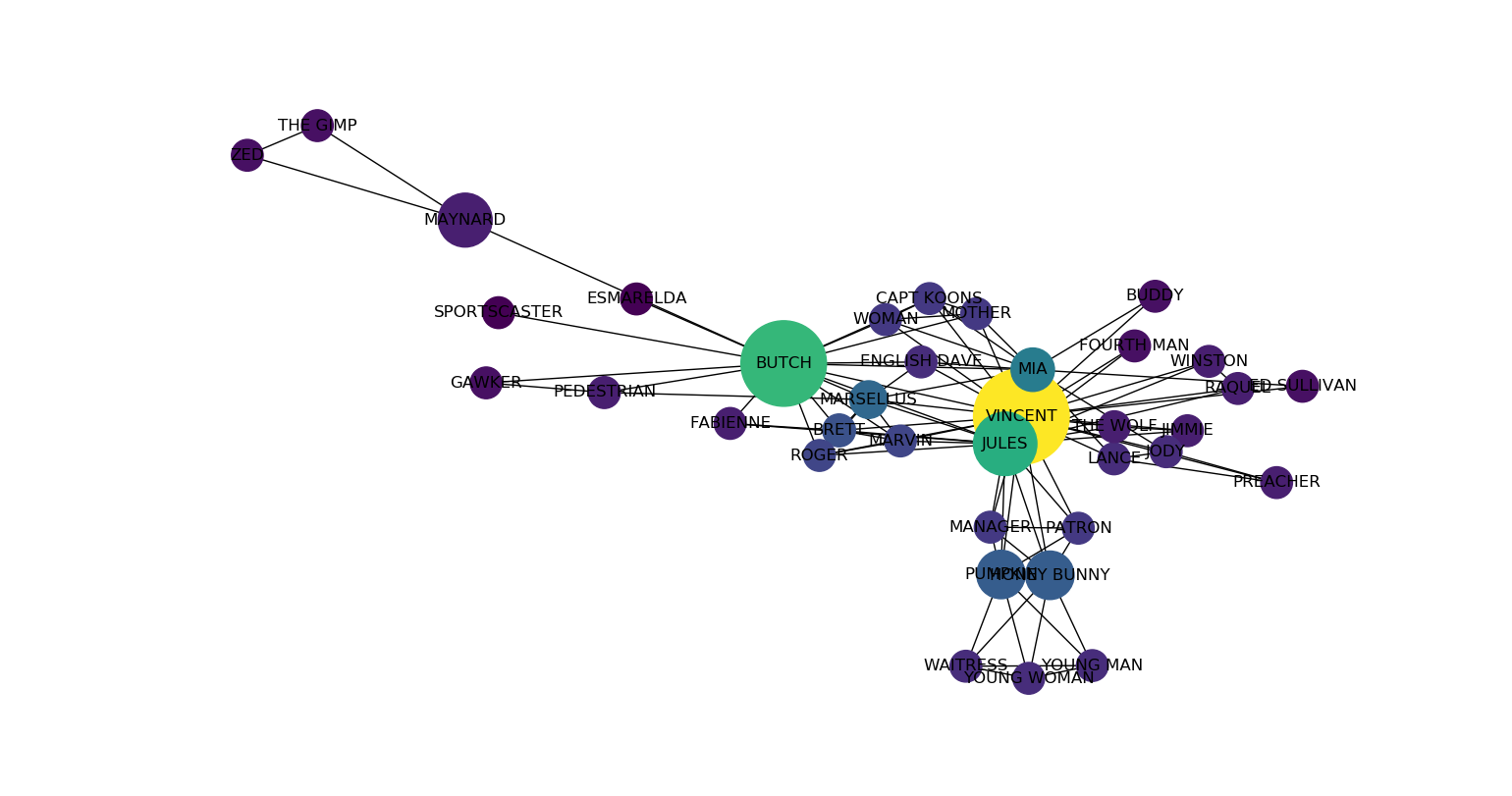
Pulp Fiction characters co-appearance
And here are the communities for Pulp Fiction:
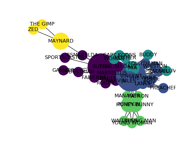
Communities in Pulp Fiction
The Departed
Now onto The Departed. Here’s the graph showing the characters who appear together:
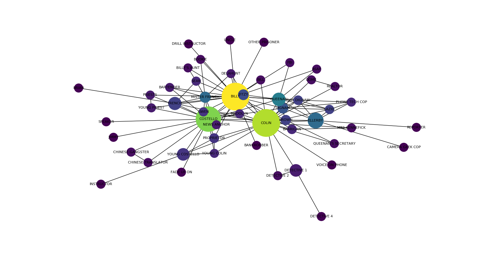
The Departed characters co-appearance
And finally, the communities in The Departed:
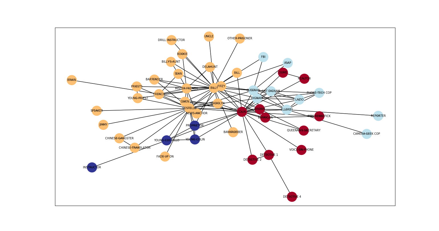
Communities in The Departed